Monthly Vehicle Traffic via MTA Bridges and Tunnels
Overall Vehicle Traffic via MTA Bridge and Tunnels
Monthly Vehicular Traffic at Port Authority tunnels and bridges (All Crossings)
Back to Home
Weekly Vehicle Traffic via MTA Bridges and Tunnels

MTA Subway Ridership Trends

Back to Home
MTA Bus Ridership Trends
MTA Bus Speed
Trends
Back to Home
Citi Bike Heat Map
Back to Home
Citi Bike Trends to 2019
Citi Bike Trends to 2020
Corridor Travel Time
Back to Home
Speed Map
Percentage of Crashes by Injury Type
Back to Home
Reported Crashes
Speeding Tickets
Speeding Ticket Spatial Distribution
Back to Home
Average GVW, Class 9
Back to Home
QB Vehicle Hourly Speed
SIB Vehicle Hourly Speed
Average GVW, Class 6
Average Daily Truck Traffic (ADTT)
Average Daily Traffic (ADT)
MTA Metro North Railroad Ridership Trends
Back to Home
MTA Long Island Rail Road Ridership Trends

MTA Access-A-Ride Ridership Trends

Back to Home
Back to Home

Monthly Ridership for Yellow and Green
Taxis

Yellow and Green Taxi Passenger Counts

Percentage Drops as Compared to Jan 2020

Yellow, Green Taxi and HVFHS Trip
Duration

Yellow and Green Taxi Trip Distance

Monthly Ridership for FHV and HVFHS

User Guide:
Date Filter → Select one/multiple dates to show corresponding data on the graph. Selecting any date values would display the line graph of those selected dates.
Timestamp Filter → Select one/multiple date stamps separated hourly to visualize the filtered data on graph. If ‘Date Granularity’ is selected as Hour then data is displayed for the corresponding selected hourly values.
Date Granularity → Select date or hour as the data display mode. Day Granularity should be selected to view data in combination with Date Filter. Hour Granularity can be used along with Timestamp Filter for hourly visualization of data.
Mode

  1. Timeline → Shows daily data in the form of trend line
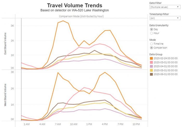
  2. Comparison → Specific date visualization between two Bound Volumes

Date Group → Useful in Comparison Mode to highlight single date data
Filter Down Arrow

  1. Include Values → The graph will represent the selected values from the filter
  2. Exclude Values → The graph will display values except the selected values from the filter

Comparison Mode Example: